15 November 2019
“History never repeats itself, but it often rhymes.” – Mark Twain
The International Monetary Fund has referred to the current era as the second “Gilded Age”. The term, made popular by Mark Twain in 1873, refers to a thin coating of gold applied to a surface to make it appear more ornate. When viewed as a whole, the economy of the late 1800s appeared to be one of unprecedented growth—the thin gold gilding—driven by technological innovation that helped the great industrial expansion of railroads, mining/oil and finance. However, the newly generated wealth was concentrated amongst a small number of industrialists, bankers and various robber barons. In fact, between 1860 and 1900, the wealthiest 10% of American households owned about 75% of the nation’s wealth[1], resulting in serious social inequality.
The Second Gilded Age?
Currently, we are in the midst of another era of technological innovation: the Information Age. Firms such as Amazon, Google and Facebook dominate the landscape and have created thousands of millionaires. Meanwhile automation has eliminated thousands of jobs and economic inequality has approached levels not seen since before WWII, with the bottom 50% of the global adult population collectively holding less than 1% of the world’s wealth and the top 10% holding 85%[2].
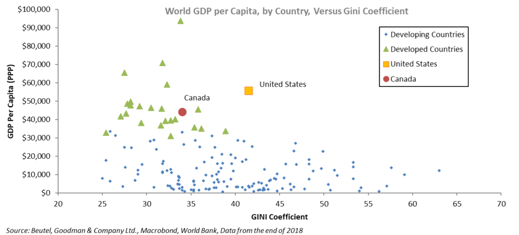
The U.S. especially appears to be an outlier when compared to its developed-country peers. The chart below shows that the U.S.’s GDP per capita versus its Gini coefficient of income is very skewed (the Gini index is a measure of inequality; an economy with equal distribution of income would have a Gini coefficient of 0.0 while an economy in which one person has all the income would have a coefficient of 100). Other countries that have Gini coefficients similar to the U.S. (which is at 41.5) are Malaysia, Haiti, Argentina, the Ivory Coast and Turkey. Canada has a coefficient of 34.
The global economy appears to be in a precarious position, evidenced by the heightened geopolitical risks. In Europe, anti-establishment sentiment is rising, from authoritarianism in Central and Eastern Europe to Brexit to a populist government in Italy. The U.S. continues to pursue a global trade war with China and the risk of starting one with Europe is rising as the U.S. begins to implement tariffs. The rise of populism and geopolitical risk is largely a result of economic inequality. If economic growth continues to slip, the geopolitical risks will only increase.
The first Gilded Age didn’t end quickly. In 1894, the U.S. tried to impose an income tax (2% for income over $4,000, which is approximately $115,000 in today’s dollars), but the Supreme Court turned it down. Income tax was considered “un-Democratic, inquisitorial, and wrong in principle”[3]. It wasn’t until 1913 that the U.S. ratified the Sixteenth Amendment, which allowed Congress to levy an income tax.
Today, the same rhetoric is being used against recent proposals from Democratic presidential candidates Elizabeth Warren and Bernie Sanders for a wealth tax. It took two world wars, a great depression and President Roosevelt’s “New Deal” before economic growth began to take off again and improve income and wealth equality. The inequality of today began in the 1980s as the stagnant and over-regulated economy of the 1970s drove the re-introduction of laissez-faire economics.
The question now is, how do we position ourselves for something that may be addressed or may worsen, depending on the outcome of U.S. elections next year? These issues can take decades to resolve, and markets are fickle. The economic tides that gradually take hold under the surface often have no market effect and don’t matter until one day they become the only thing that matters.
Portfolio Positioning
We are cognizant of these risks and as a result, our fixed-income portfolios are slightly long duration as growth prospects appear weak. Any rise in interest rates will have an adverse effect on the consumer and corporate sector of the economy (see box on next page). We also remain selectively overweight corporates. When we examine corporations for investment purposes, we consider several metrics and look beyond simple aggregate numbers so that if spreads do widen, we are well-positioned in the corporate debt market and hold positions that should outperform and retain value in turbulent times.
NOTES
[1] Tindall, George Brown and Shi, David E. (2012). America:
A Narrative History (Brief Ninth Edition) (Vol. 2). W. W. Norton & Company. ISBN 0393912671 p. 589
[2] Credit Suisse, Global Wealth Report 2018. Report can be downloaded via https://www.credit-suisse.com/about-us-news/en/articles/news-and-expertise/global-wealth-report-2018-us-and-china-in-the-lead-201810.html.
[3] “Mr. Cockran’s Final Effort”, The New York Times, January 31, 1894. Article can be downloaded via https://timesmachine.nytimes.com/timesmachine/1894/01/31/104107025.pdf
Simulation of a Complex Economic System
The economy is a complex system. Most economic theories are based on aggregate numbers; GDP, inflation, unemployment, investment and debt are just a few of the metrics that economists look at. However, when one looks at the economy as a complex system with multiple agents, such as consumers, companies and countries that are unique and interact with each other, then one gains a deeper understanding of the underlying dynamics of the economy and its associated risks.
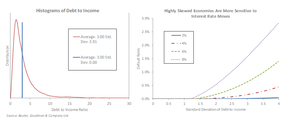
Take, for example, the debt-to-income ratio. On aggregate, it looks healthy for most sectors of the U.S. economy, but if one looks below the surface, the distribution of the debt is dangerously skewed.
We ran several simulations of different economies with several economic agents, be they consumers or corporations, with various debt-to-income ratio distributions ranging from a small standard deviation (blue line in the chart on the left, below, where the ratio ranges from 2.99 to 3.01) to one where the debt ratio is massively skewed (red line in the same chart, with debt to income ranging from 0 to 30). However, the important measure of average debt ratio remained the same in all of our simulations. Economists who only look at aggregate average numbers would not be able to differentiate between all these different simulated economies.
We shock our simulated economies with various interest rates and the resulting default rates are very different. This is illustrated in the chart on the right below, where the low debt-to-income distribution economies have no defaults when interest rates change. As the debt-to-income distribution widens (moving right on the x-axis of the bottom-right-hand chart) rising interest rates cause higher defaults. The highly skewed economies are much more sensitive to a rise in interest rates, even though the average debt to income is the same in all cases!
The bottom line is that by adding a simple element of complexity to our economy, we get very different results. The fragility of the skewed economy becomes evident. We must look beyond aggregate numbers and beneath the gild on the economy to get a full picture.
Download PDF
Related Topics and Links of Interest:
- Modern Monetary Theory: Voodoo Economics?
- Due Diligence and Credit Defaults
- Beutel Goodman Mutual Funds
This information represents the views of Beutel, Goodman & Company Ltd. as at November 15, 2019 and is subject to change without notice. It is provided for information purposes only and is not intended to be, and should not be relied upon as, specific financial, investment, tax, legal or other advice.
©2019 Beutel, Goodman & Company Ltd. All rights reserved. Do not copy, distribute, sell or modify without the prior written consent of Beutel, Goodman & Company Ltd.
